The year 2025 marks a return to the very essence of refinement. Far from decorative exuberance, contemporary elegance is now expressed through measured palettes, enveloping hues, and subtle harmonies. In this spirit, color regains its fundamental role: to reveal space with precision, to highlight the nobility of materials, and to create soothing and unique atmospheres.
The dominant, understated and organic base to structure the space
To create a high-end atmosphere, the choice of dominant colors leans towards warm neutrals and earthy tones, true pillars of a timeless decoration.
Mocha mousse, the new sophisticated neutrality
Named Pantone's Color of the Year, Mocha Moss stands out as a soft and enveloping alternative to classic brown . This shade infuses rooms with subtle warmth while harmonizing beautifully with muted shades of sage green, grayish blue, or dusty rose. Applied to a solid wall, it enhances living or relaxation spaces with understated elegance.
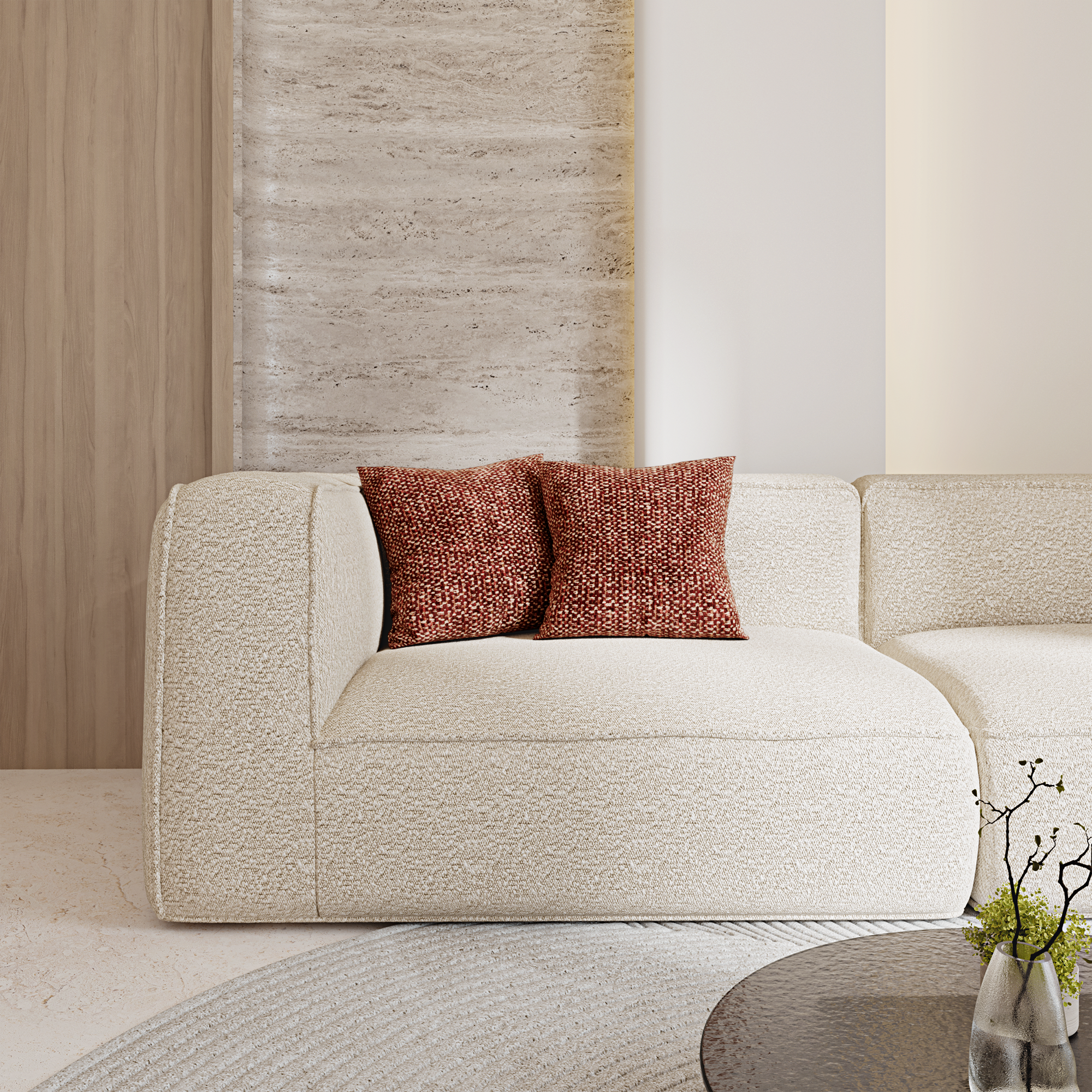
Beige, sand, cream for a soft and permanent light
Light neutrals retain their timeless status. Beige, sand, or cream structure the space without ever weighing it down. These shades provide an ideal backdrop to reveal the richness of raw materials—solid wood, veined marble, full-grain leather—while bringing a sense of serenity and visual continuity.
The artisanal soul of terracotta and caramel
To lend the space a warmer feel , earthy tones , inspired by natural pigments, are subtly introduced. Matte terracotta, rich caramel, and cinnamon brown evoke the material in its most authentic form. These shades find their place on a wall, in the upholstery of a velvet sofa , or on a ceramic object.
Deep accent colors to assert character
Once the chromatic base is established, the palette is enriched with bolder touches. Accent colors play a role of controlled contrast , giving the decor its personality while maintaining a certain restraint.
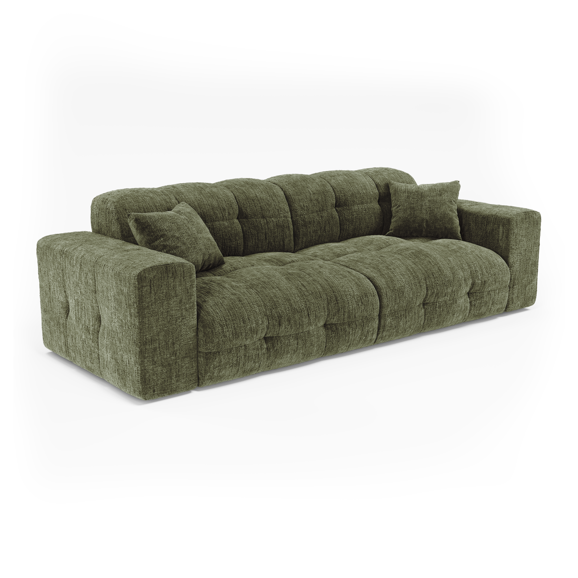
Organic green, between grounding and calming
Deep greens —olive, sage, moss—are essential. Closely linked to nature, they create a subtle connection between indoors and outdoors . Whether used as an accent wall or in the choice of a velvet armchair , they harmonize perfectly with metallic finishes (chrome, brushed brass). Combined with light or dark woods, they create serene, balanced, and decidedly contemporary atmospheres.
A muted horizon with blue
From pastel blue to midnight blue, blue remains a safe bet for creating balanced spaces . In a bedroom, sky blue promotes calm and relaxation. Used in a library or formal room, midnight blue introduces a structuring visual density. Combined with warm metals or noble materials, it suggests stability and timelessness.
The structuring contrast of dark hues
In a bolder vein, dark tones offer valuable visual anchoring . Slate gray, subtle and rich, is perfect for a basement or workshop. Conversely, charcoal black, used on furniture legs, pendant lights, or frames, defines the structure of the space without ever darkening it. These kinds of shades demand impeccable finishes and precise application to maintain the overall light balance.
Bright touches to awaken harmony
To liven up the palette without breaking its harmony, certain bright shades appear in small touches, often occasional but always meaningful.
The measured bursts of mustard yellow
Deep yet luminous, mustard yellow should be handled with care. A graphic cushion , a piece of art, or a ceramic can be enough to enliven a neutral setting. They bring brightness and vibrancy while maintaining a certain sophistication, especially when combined with cream or taupe backgrounds.
The soft pigmentation of the orange hues
Drawn from nature and light, coral, apricot, or amber orange soften even the most understated compositions . They find their place on textile accessories, a throw, a table lamp, or a small lacquered piece of furniture. Their effect is all the more striking when used sparingly, like a chromatic breath in a muted setting.
The consistency between materials, finishes and monochrome
While color structures visual perception, it is the material that reveals its depth. In 2025, refinement will be achieved through perfect harmony between hues, textures, and finishes .
Natural materials and matte finishes
The choice of materials remains paramount. Fine wood, travertine, raw stone, and full-grain leather lend a tactile authenticity that transcends mere decoration. As for the finishes, they are matte or subtly satin. They discreetly absorb light and enhance the feeling of understated luxury.
Discreet metals for refined details
Aged brass, polished chrome, or patinated bronze act as elegant punctuation marks . Applied to light fixtures, handles, or furniture frames, they capture the light without ever dazzling it. Subtly placed, these metallic details infuse a controlled modernity into interiors rooted in the tradition of beauty.
The audacity of monochrome
Sometimes, the ultimate in sophistication lies in the rejection of contrast. An interior designed in a single color scheme—beige, brown, green—creates a remarkable impression of unity and fluidity. But when monochrome is combined with plays on textures and volumes, it generates an enveloping and almost architectural effect .
Towards a balanced palette for a high-end interior
By 2025, color will be part of a holistic approach to space. Each hue will be chosen for its ability to interact with materials, structure light, and enhance the character of the space. A carefully curated palette will thus become the most fitting expression of a high-end interior: understated, timeless, and unique.