More than just an aesthetic choice, color shapes the ambiance and atmosphere of an interior. When vibrant, it acts as a true source of energy, capable of transforming a decor and giving it a unique character. These intense, luminous, and invigorating shades attract the eye and create an immediate presence in the space. Used judiciously, they transform an interior, lending it both dynamism and timeless elegance.
The expressive power of intense colors
Vibrant colors speak directly to emotions . Their intensity stimulates, awakens, and inspires, far beyond the purely visual aspect. They allow us to break with the monotony of neutral palettes by introducing a touch of refined contrast .
In a living room, a bright orange or a sunny yellow creates a warm and inviting atmosphere, ideal for sharing moments. In an office or creative space, a bold blue enhances concentration and stimulates the imagination. In a bedroom, a deep green brings balance and serenity without sacrificing intensity.
Choosing a vibrant color means adding rhythm to your interior, but also asserting a decorative style. It means daring to express yourself boldly while maintaining harmony, so that the vitality of the space combines with lasting elegance.
Vibrant colors: four major inspirations
The warm glow of orange hues
The quintessential color of dynamism, orange brings a sunny energy that illuminates an interior. In its vibrant shades, it is stimulating and inviting , ideal for a living room where you love to gather. Paired with terracotta, which is softer and earthier, it gains depth and sophistication. Together, they evoke Mediterranean warmth and mineral textures , perfect for a contemporary interior seeking character. On a feature wall, a graphic rug, or a generously sized seat, these tones transform the atmosphere, lending it intensity and warmth.
The soft light of a sophisticated yellow
More muted than a bright yellow, mustard yellow embodies a refined luminosity . Both bold and warm , this shade blends beautifully with a neutral base of beige, light gray, or off-white. It can be introduced into a living room through cushions, a designer armchair, or elegant curtains that capture natural light. Paired with midnight blue, it creates a strong, contemporary contrast, while with wood tones, it reveals a warm and timeless dimension.
The contemporary energy of assertive blue
Electric blue makes a bold statement with an almost vibrant intensity . In an interior, it acts as a powerful, modern, and creative accent . Placed on a striking sofa or a rug with geometric patterns, it immediately draws the eye and structures the space. This color finds its perfect place in contemporary environments where a touch of controlled energy is desired. Combined with light shades like pearl gray or off-white, it becomes elegant and dynamic. With touches of metal, it acquires a decidedly urban and sophisticated dimension.
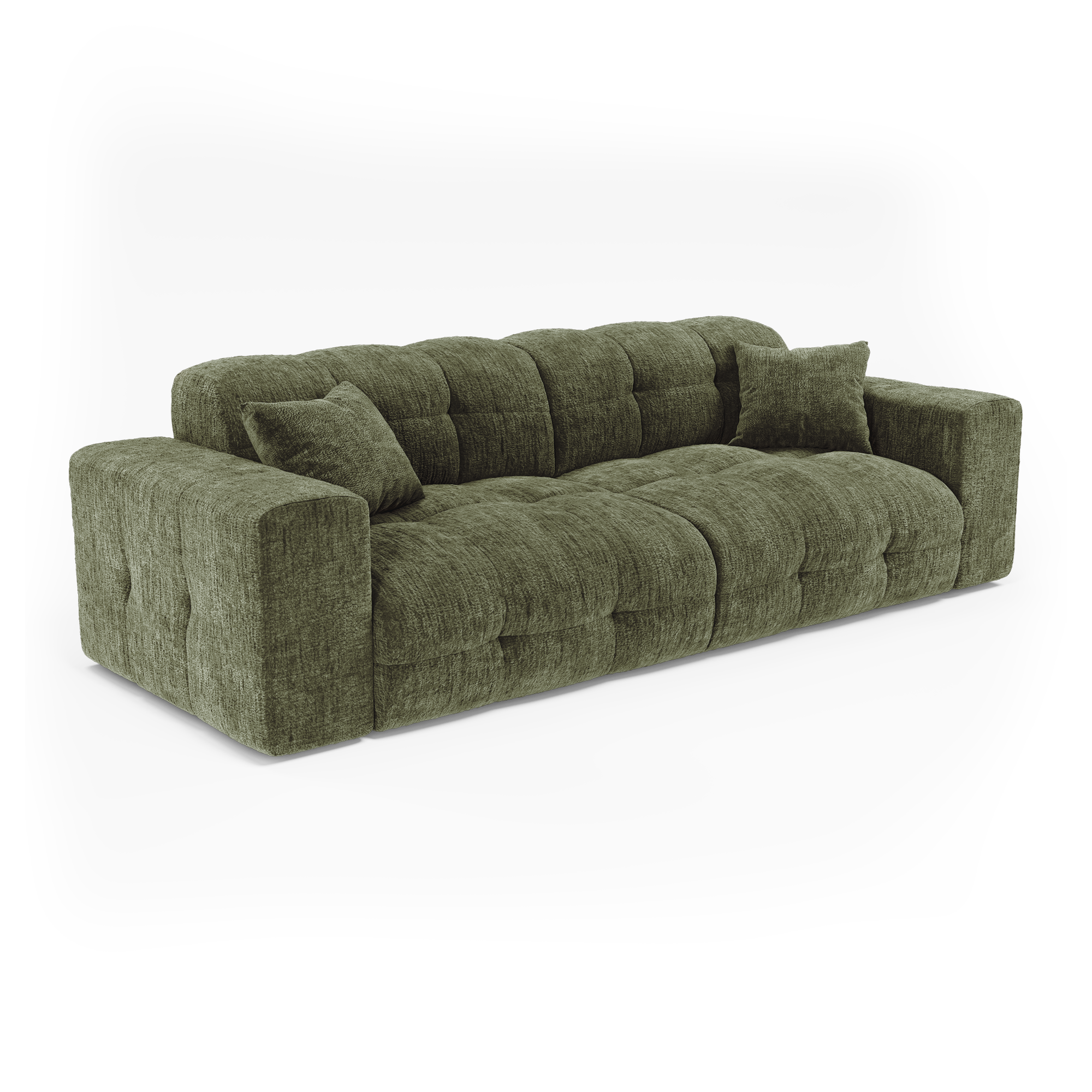
The luxurious depth of precious greens
Evoking the richness of precious stones, emerald green stands out as a distinctive color, both luxurious and soothing. Deep and enveloping , it finds its place in elegant living rooms, intimate bedrooms, or even hushed libraries. Paired with gilded brass, it reveals an Art Deco allure , full of nobility and refinement. In contrast to natural materials—linen, light oak—it expresses a subtle modernity, rooted in timeless elegance.
The art of mastered chromatic balance
Introducing a vibrant color requires a delicate touch. It can appear in subtle touches through accessories—cushions, vases, light fixtures, curtains—or make a bold statement on a wall, rug, or piece of furniture. The choice depends on the desired intensity of the color in the space. Combining different shades is essential. Mustard yellow pairs perfectly with midnight blue, creating an energetic and sophisticated duo. Emerald green flourishes alongside gold or brass, in a contemporary Art Deco style. Terracotta orange reveals its full power alongside sandy beige or warm white, evoking a sunny, Mediterranean atmosphere.
To visually structure a space, the 60-30-10 rule remains a valuable guideline: 60% neutral color for balance, 30% secondary color to enrich the palette, and 10% vibrant shade to create an accent. This principle allows for the integration of bold colors without risking overload and ensures a decor where vitality remains elegant.
Elegance in restraint
Bright colors have such a powerful visual impact that they require judicious use . Combining too many in the same space makes it difficult to read and can quickly tire the eyes. It's better to choose a main color and subtly incorporate it in different elements.
Light also plays a crucial role: an electric blue can appear luminous in a large, sun-drenched living room, but seem overwhelming in a small, dark room. Adapting the intensity of the colors to the size and brightness of each space ensures successful integration.
Embrace vitality, preserve harmony
Vibrant colors are much more than a simple decorative choice: they infuse energy, vitality, and character into an interior. Orange, yellow, blue, or green—each one displays a strong personality, capable of transforming the atmosphere of a room. Their strength lies in their balance: carefully chosen, paired with neutral tones, and integrated according to the room's dimensions, they become the signature of a lively and elegant interior.
To embrace color is to accept that it is the expression of a strong style, but always guided by a search for harmony. Thus, each space is adorned with a controlled vitality, where chromatic boldness meets timeless elegance.